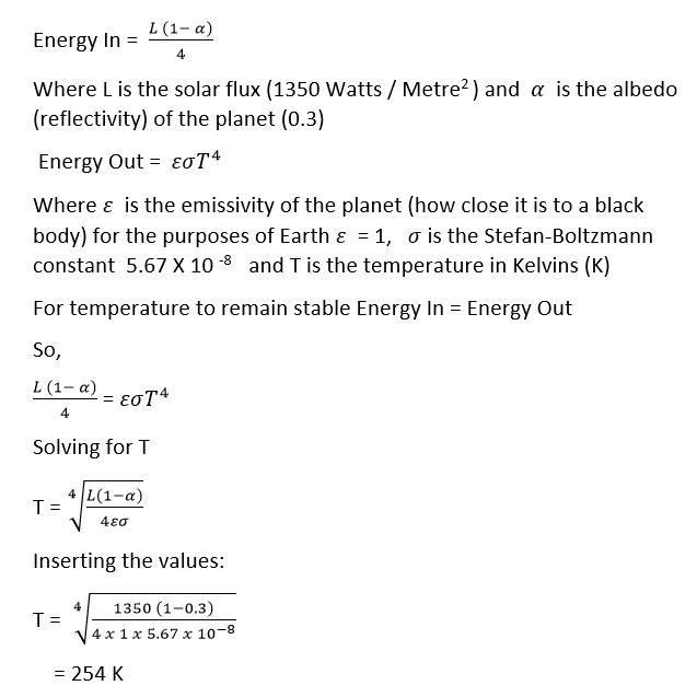
This is very cold, as Kelvin is the absolute temperature scale. Zero K is -273 degrees Celsius (oC), so zero Celsius is 273 Kelvin. Consequently 254 K is -19oC. As global temperature is about 15oC , the calculation above concludes that global temperatures should be about 34oC lower than that actually measured.
The derivation of the formulae above is explained in the following video.
It has been clear for a long time that humanity has been actively burning fossil fuels (coal, natural gas, and oil) and clearing land. These processes have been occurring for the last two centuries. These activities add carbon dioxide (CO2) to the atmosphere. Nineteenth-century science showed that increasing CO2 would warm the climate. See this link for details of the Nineteenth-century science.
MEASURING ATMOSPHERIC CARBON DIOXIDE LEVELS
It was not until 1958 that scientists started direct measurement of CO2 in the atmosphere when Charles David Keeling, started measuring atmospheric CO2 levels at Mauna Loa Observatory in Hawaii, and a number of other places including Antartica. It became obvious within a few years that CO2 was increasing in the atmosphere. The graph that he produced has become known as the Keeling Curve. The latest version of the Keeling Curve (as if the time of writing this post) is displayed below. Note the measurements are in parts per million (ppm).
Figure 1: The Keeling Curve
Source: https://scripps.ucsd.edu/programs/keelingcurve/wp-content/plugins/sio-bluemoon/graphs/mlo_full_record.png
The Keeling Curve only extends back to 1958, but it is possible to determine the CO2 concentration in earlier times from ice cores. For information about ice cores click on this link. Ice cores contain bubbles of air from the time that the ice was formed. To check that the bubbles of air in ice cores faithfully reflected the air at the time of ice formation, scientists compared ice core bubble measurements with atmospheric measurements during the period of overlap of the two air sources. The graphic below shows the results of that analysis - the air in ice bubbles is very similar to that of air at the time of the ice formation.
Figure 2: Validating Ice Core CO2 Measurements
Source: Source: https://www.climatescience.cam.ac.uk/docs/icecoreco2.pdf
Sections of ice cores can be dated by the following methods:
Counting the annual layers based on visual appearance (summer layers are often darker due to more dust content or ice that has melted and then refrozen)
Measuring the concentration of particular radioactive isotopes with a known half life such as tritium,
Chemically matching volcanic layers with known eruptions that have been previously dated.
Using these methods for dating ice cores and analysing the air bubbles trapped in the ice it is possible to determine the CO2 levels in the past. The graphic below shows the CO2 level for the last 10,000 years. The values up to 1958 were determined from ice cores, post 1958 from direct atmospheric measurements.
Figure 3: CO2 Levels Over the Last 10,000 Years
Source: https://scripps.ucsd.edu/programs/keelingcurve/wp-content/plugins/sio-bluemoon/graphs/co2_10k.png
Note that for all of this period with the exception of the last 200 years the CO2 level was steady, only varying between 260 ppm to 280 ppm, a variation of only 20 ppm. In the last two centuries, though, it has increased from 280 ppm to 408 ppm, ie by 128 ppm. The last 200 years are clearly very different to the rest of the record.
The amazing anomaly of the last two centuries is even more obvious when the last 800,000 years are considered, as shown in the graphic below.
Figure 4: CO2 Levels Over the Last 800,000 Years
Source: Source: https://scripps.ucsd.edu/programs/keelingcurve/wp-content/plugins/sio-bluemoon/graphs/co2_800k.png
Over the last 800,000 years the CO2 level has varied between 150 ppm and 300 ppm. Our current level of CO2 is over 100 ppm higher that any other level in the past 800,000 years! The level of CO2 in the atmosphere is continuing to rise.
MEASURING HUMAN CAUSED CARBON DIOXIDE EMISSIONS - SOURCES AND SINKS
That the dramatic increase in CO2 coincides with rapid industrialization and land clearing strongly suggests a human origin of the extra CO2, but serious study of historical human carbon emissions did not begin until the early 1980s with the work of Brian Mitchell. For many references on the process of compiling data sets on human carbon emissions see this link and this one.
Figure 5: Human Carbon Emissions
Source: Source: http://cdiac.ess-dive.lbl.gov/trends/emis/glo_2010.html
Human Carbon Emissions shown in Figure 5 are very similar to The Keeling Curve since 1700 as shown in Figure 6, providing strong evidence that the CO2 increase in the last few centuries is strongly influenced by human CO2 emissions.
Figure 6: The Keeling Curve Since 1700
Source: https://scripps.ucsd.edu/programs/keelingcurve/wp-content/plugins/sio-bluemoon/graphs/co2_800k_zoom.png
If you carefully compare Figure 5 and Figure 6, it looks like human CO2 emissions are increasing more quickly than the increase in the amount of CO2 in the atmosphere. It is possible that this is a false impression, with the graphs using different scaling and units. Figure 7 shows human CO2 emissions and and CO2 levels in the atmosphere on the same graph using the same scaling and units. Clearly human emissions of CO2 are increasing at a faster rate than CO2 accumulation in the atmosphere.
Figure 7: CO2 Emissions Vs CO2 Levels
Source: Source: https://radioviceonline.com/wp-content/uploads/2009/11/knorr2009_co2_sequestration.pdf Figure 1.
(The only difference between this graphic and Figure 1 from the Knorr paper is the addition of the labels to make it clearer.
In the Knorr paper the various lines were described in the description of the figure.)
The atmosphere only takes up about 46% of human carbon emissions, as shown in Figure 7. This is clear evidence that all of the increase in CO2 in the atmosphere in the last two centuries comes from human sources. So where does the rest of the CO2 emitted by humans go to. There are only two possible locations, the oceans and the biosphere. As figure 8 shows this is clearly the case.
Figure 8: Anthropogenic (human caused) Sources and Sinks in 2005
Source: http://www.ldeo.columbia.edu/~spk/Research/AnthropogenicCarbon/anthroco2.html
Here is the authors' commentary on Figure 8:
The cartoon ... attempts to summarize our current knowledge of the sources and sinks of anthropogenic CO2. There are two principal sources. The largest is the burning of fossil fuels which emits on the order of 8 PgC/y. (A petagram (Pg) is 1 billion metric tons.) The second largest, at around 1.5 PgC/y, is changes in land use, primarily deforestation in the tropics to make way for agriculture. Estimates for this source are relatively very uncertain however. Together, these two sources contributed somewhere between 370 to 610 PgC between the start of the industrial period (nominally taken as 1765) and 2005. So what happened to this CO2? Less than 50% of it, or 215 PgC, currently resides in the atmosphere so the balance must have been taken up by the ocean or the terrestrial biosphere. It is believed that the ocean sequesters 20 to 35% of manmade CO2 emissions and thus plays a critical role in mitigating the effects of this perturbation to the climate system. However, considerable uncertainties remain as to the distribution of anthropogenic CO2 in the ocean, its rate of uptake over the industrial era, and the relative roles of the ocean and terrestrial biosphere in taking up manmade CO2.
Irrespective of the uncertainties in the exact values it is clear that all of the extra CO2 in the atmosphere over the past 200 years has come from human sources, as more than half of the human CO2 have been sequestered in the ocean or biosphere.
CARBON ISOTOPES
Atoms consist of a positively charged nucleus surrounded by a cloud to negatively charged electrons. The nucleus consists of positively charged protons and neutral neutrons. The number of protons determines the element - for instance hydrogen has one proton, carbon has 6 and oxygen has 8. A neutral atom has the same number of electrons as protons. The number of neutrons in an atomic nucleus can vary - producing different isotopes of the element. For instance carbon can have 6 neutrons, 7 neutrons or 8 neutrons making Carbon-12, Carbon-13 or Carbon-14 respectively. See diagram below:
Figure 9. Isotopes of Carbon
In the graphic above the average concentraton of Carbon-13 is 1.1%, but this can vary in different substances. The amount of Carbon-13 in a particular sample is measured as the ratio between Carbon-13 and Carbon-12, which is called delta 13C, and is written as δ13C. It is measured in parts per thousand which has the symbol ‰. Values of δ13C are determined in relation to a standard called Pee Dee Belemnite (PDB), sometimes called VPDB (for "Vienna PDB"). For details click on this link. The standard material has a high concentration of Carbon-13 and was established with a δ13C value of zero; consequently most substances have a lower (ie negative) value. The more negative the value the less Carbon-13 in the substance. A substance with a δ13C‰ value of -28 will have less Carbon-13 than a substance with a value of -10.
The table below shows delta values for Carbon-13 and Carbon-14 for some important CO2 pools.
Figure 10. Delta values for Carbon-13 and Carbon-14
Source: Source: https://www.esrl.noaa.gov/gmd/outreach/isotopes/mixing.html
It is clear from Figure 10, that Fossil Fuels are significantly more depleted in Carbon-13 than the atmosphere (ie -28 compared to -8). If a large amount of CO2 from Fossil Fuel burning is added to the atmosphere then the δ13C‰ should decline. That this has happened is clear from the graphic below:
Figure 11. CO2 Concentration Vs Carbon-13 Concentration
Source: Source: https://agupubs.onlinelibrary.wiley.com/doi/full/10.1002/jgrd.50668
For the 800 years between 1000 AD and 1800 AD The values of atmospheric CO2 and δ13C‰ were steady, but when at about 1800 CO2 levels began to increase δ13C‰ values began to decline. This can only be explained if the increase of CO2 was from Fossil Fuel burning or the clearing of forests - ie from Human Activities.
As Fossil Fuels are also highly depleted in the radioactive isotope of Carbon, Carbon-14, that isotope should decline in the atmosphere as CO2 is increased, if the increase in CO2 is caused by fossil fuel burning. This is indeed the case. See this link, particularly Figure 1C. Delta Carbon-14 decreased until the atmospheric atomic bomb tests in the 1950s. The additional Carbon-14 put into the atmosphere by the bomb tests has been used as a tracer to analyse Carbon Cycle processes.
OXYGEN DECLINE
As carbon is burned it combines with Oxygen to produce Carbon dioxide - CO2. This process should remove some oxygen from the atmosphere. This is what is found to have happened.
In the brief video below Jeff Severinghaus, a professor of geosciences from Scripps Institution of Oceanography, University of California, discusses the graphic in Figure 12.
Video 1: Oxygen decline as a result of carbon burning
That the biosphere is growing slightly should not be surprising as it is a net carbon sink - see Figures 7 and 8.
Figures 7,8,10 and 11, provide evidence that the oceans are a net carbon sink, ie that CO2 is being added to the oceans. Another piece of evidence for this comes from changes in ocean chemistry, particularly changes in the Acidity / Alkalinity of the oceans measured with a value called pH.
The video below explains the chemistry, as well as changes that have been measured and implications for life in the ocean.
Video 2: Ocean chemistry
This process is often called Ocean Acidification. Oceans are currently Alkaline (basic) but as video 2 explains, increases in CO2 will reduce the pH of the ocean moving it in a more acidic direction.
It is clear that ocean pH is declining. Here is a graph showing data from three oceanic areas - Bermuda (Caribbean), Canary Islands (Tropical Atlantic) and Hawaii (Pacific) showing increasing CO2 in the oceans and decreasing pH.
Figure 13. Oceanic CO2 and pH levels at three sites.
Source: https://www.epa.gov/climate-indicators/climate-change-indicators-ocean-acidity
Note that there is significant seasonal variability in the data but the long term trend is unmistakable.
The pH scale is logarithmic so the decline is significantly larger than appears in the graphs.
For the pre-industrial value of oceanic pH see this link, section 2.6 and Table 1. Pre-industrial pH level 8.18 current level 8.07, a decline of 0.11 pH units. This does not sound a large difference but remember that pH is a logarithmic scale.
Figure 14. The pH scale.
Source: https://pmel.noaa.gov/co2/story/A+primer+on+pH
The scale measures the number of H+ ions in a litre of water, (measured in moles). A change of 1 in the scale changes the number of H+ ions by 10 - for instance, changing from 9 to 8 will increase the number of H+ ions by 10. The way to calculate a percentage change is by using the actual values of H+ ions. Figure 14 and the associated source explains this.
The decline in pH since pre-industrial times is about 30%.
VOLCANOES
Some people make the claim that the increase in CO2 comes from Volcanoes. For instance, Ian Plimer in his book "Heaven and Earth" on page 413 claims: "Volcanoes produce more CO2 than the world's cars and industries combined."
"Over the past 250 years, humans have added just one part of CO2 in 10,000 to the atmosphere. One volcanic cough can do this in a day."
So how do human carbon emissions compare with volcanic carbon emissions?
Here is a link to an article by Terry Gerlach estimating volcanic carbon emissions. Gerlach,s conclusion is quoted below:
Global estimates of the annual present- day CO2 output of the Earth’s degassing subaerial and submarine volcanoes range from 0.13 to 0.44 billion metric tons (gigatons) per year [Gerlach, 1991; Allard, 1992; Varekamp etal., 1992; Sano and Wil-liams, 1996; Marty and Tolstikhin, 1998]...
Burton, Sawyer and Granieri at this link in a more recent paper than Gerlach, give a figure of 540 Mt/yr ie 0.54 billion tons. If carbon emitted from the Earth from non-volcanic sources are included the figure rises to 840 Mt/yr ie 0.84 billion tons. It is possible that estimates of volcanic will rise with more research, but it is very unlikely that volcanic emissions will rival human ones. Immediately after stating the 840 mt.yr figure Burton et note: "The global subaerial CO2 flux we report is higher than previous estimates, but remains insignificant relative to anthropogenic emissions, which are two orders of magnitude greater at 35,000 Mt/yr (Friedlingstein et al. 2010)."
Gerlach also notes that there are other reasons for rejecting the claim that volcanic CO2 emissions rival human ones. He discusses these in a section called "Problematic Implications" where he concludes:
In short, the belief that volcanic CO2 exceeds anthropogenic CO2 implies either unbelievable volumes of magma production or unbelievable concentrations of magmatic CO2. These dilemmas and their related problematic implications corroborate the observational evidence that volcanoes emit far less CO2 than human activities.
Another reason why volcanic emissions cannot rival human ones relates to the ratio of carbon isotopes. Figure 11 shows that the δ13C‰ has declined in line with CO2 in the last two hundred years. The best explanation for this is the addition of large amounts of low Carbon-13 CO2 source - ie Fossil Fuels.
Figure 15. Volcanic CO2 emissions and volcanic δ13C‰ values
Source: Source: https://www.repository.cam.ac.uk/bitstream/handle/1810/266762/Mason_final_combined.pdf?sequence=1&isAllowed=y
Table S3
Note in Figure 15 volcanic gasses have a range of -0.7 to -7.0 δ13C‰. This means that volcanic CO2 has more Carbon-13 than the atmosphere which has a value -8 δ13C‰ (see Figure 10). This should mean that volcanic outgassing would increase the value of δ13C‰ rather than reducing it as is observed in Figure 11.
SUMMARY CONCLUSION
The amount of atmospheric CO2 has dramatically increased in the last 200 years. This is very unusual (probably unique) in the last 800,000 years. See Figures 1, 3 and 4.
The increase in CO2 in the last 200 years coincided with a dramatic increase in human caused CO2. See figure 5.
Only 46% of this human caused CO2 went into the atmosphere. See Figure 7.
The rest went into the oceans and biosphere. See Figure 8.
The increase in CO2 in the oceans has changed ocean chemistry, reducing oceanic pH. See Figures 13 and 14 and Video 2
The increase in CO2 coincided with a significant change in carbon isotopes that can only be explained by human caused CO2 increase. See Figure 11.
As fossil fuels are burned the Oxygen in the atmosphere should decline. This decline has been measured. See Figure 12 and Video 1.
Other sources of the increased CO2 have been ruled out. The ocean is clearly a sink not a source of CO2. Measurements of volcanic emissions and volcanic gas carbon isotope ratios preclude volcanoes as a source of the increased CO2
Writers and researchers in the second half of the 19th century credited Fourier with being the first to allude to the greenhouse effect.
In an article in 1924 (and reprinted in English in 1927) he wrote:
the temperature (of the Earth) can be augmented by the interposition of
the atmosphere, because heat in the state of light finds less resistance
in penetrating the air, than in repassing into the air when converted
into non-luminous heat.
Source: Fourier J (1824). "Remarques Générales Sur Les Températures Du Globe Terrestre Et Des Espaces Planétaires". Annales de Chimie et de Physique 27: 136-67, quoted at this link.
The quotation sounds remarkably like the modern understanding of the greenhouse effect, but Fourier's understanding of the phenomenon is often overstated. He seems to mean by the quote something like the operation of greenhouses, which do not work the same way as the modern effect named (erroneously) after them. Fourier also thought that the atmosphere was warmed more effectively by other factors including the internal heat of the planet and heat from the stars.
For a detailed discussion of Fourier and the greenhouse effect see this link, from pages 55 to 64. A brief analysis can be found on pages 2 and 3 of this document.
The Discovery Greenhouse Gasses by John Tyndall
John Tyndall (1820 - 1893) was a very active and prominent 19th physicist who made many original discoveries but is best remembered for his work on greenhouse gasses. His main experimental work in this field was in 1859. He discovered that the main constituents of the atmosphere, nitrogen and oxygen are transparent to infrared radiation, but that a number of trace gasses in the atmosphere were effective in absorbing infrared radiation. The main ones were water vapour and carbon dioxide (CO2).
Tyndall's experimental apparatus is shown in the drawing below.
Tyndall was aware of the implications of his finding when he noted:
To the eye, the gas within the tube might be as invisible as the air
itself, while to the radiant heat it behaved like a cloud which it was
almost impossible to penetrate. Thus, the bold and beautiful speculation
has been made an experimental fact. The radiant heat of the sun does
certainly, pass through the atmosphere to the Earth with greater facility
than the radiant heat of the Earth can escape into space.
(It is interesting to note that in the chair of Tyndall's demonstration of his discovery was Albert the prince consort. It is a sad reflection on the current political classes that a significant fraction of today's politicians do not take the active interest in science that Prince Albert did. Many of the current crop of politicians and journalists reject and distort the science on political and ideological grounds.)
Like many scientists of his time, Tyndall was particularly interested in explaining changes of climate in the past, as it was becomming increasingly clear that Europe had suffered ice ages in the past.
Tyndall was aware that the growth of industry was putting CO2 into the atmosphere but it was almost four decades before scientists seriously investigated the effect of increasing CO2 in the atmosphere.
Arrhenius was a Swedish physicist who published a study in 1896 into the effect on climate of changing the amount of CO2 in the atmosphere. Tyndall had shown that increasing CO2 would warm the climate and decreasing it would have a cooling effect. The interesting question was by how much would temperature be effected? Arrhenius performed long and tedious pen and paper calculations to provide an answer to this question. He realised that the effect of CO2 is complicated by feedbacks, what he called "the mutual reaction of the physical conditions". A major feedback process involves water vapour, which is a much more effective greenhouse gas than CO2. The increase in temperature caused by an increase in CO2 would result in more water vapour in the atmosphere which would amplfy the warming produced by increasing CO2.
Arrhenius calculated that doubling the amount of CO2 in the atmosphere would result in a 40C increase in global temperature. This wasn't a bad result as the currently accepted value is about 30C.
A few years after Arrhenius published his result Ångström published a strong criticism of it. Ångström's basic argument was that the infrared is already saturated and that increasing the CO2 in the atmosphere would not effect the absorption of the infrared radiation. This argument is still used by climate science deniers today. For an explanation of why this argument by Ångström was incorrect see the posts here and here.
For biographies of Arrhenius see posts here and here.
We have been watching some tough, violent, though compelling TV shows including Walking Dead, Peaky Blinders, Vikings, Handmaids Tale, Game of Thrones. Here is one sample from Walking Dead.
I suggested that some calmer fare was in order so last Saturday we watched La La Land. Although Margaret enjoyed it in the end, she commented part way through that it was fairy floss! Here is the opening scene, which you might argue supports her contention ...
... though I would argue that it is a positive, vibrant, infectious response to the frustration of a freeway traffic jam. I expected it to be a good movie, after all, it won 5 Academy Awards, and I wasn't disappointed. La La Land breathes new life into an old art form that many have thought irrelevant to modern culture. Mia (Emma Stone) and Sebastian (Ryan Gosling) meet often. The first time was after the traffic jam at the beginning, and that meeting did not go well. She gave him the bird. But they kept "running into each other" and resisted the obvious attraction as can be seen in the "A Lovely Night Scene".
Beautifully acted, lit, filmed, sung and danced! Eventually they bow to the inevitable and admit their love. They both have dreams. Mia to be a successful actress, Seb to open a jazz club. In more conventional musicals they would find a way to stay together and realise their dreams, but not in this story! They have to part to achieve their career desires. Their final acceptance of their separation is brilliantly displayed at the end of the film. It is five years later. Mia has a successful film career and is married, with children. On a night out with her husband, she enters the Jazz club that Sebastian has opened, and we get an alternative version of the story, as imagined by Mia ...
As the film leaves her reverie and returns to reality Sebastian is playing the piano, but the melody is not resolved, it needs two more notes to reach a cadence. Is this a sign that Sebastian still has hopes for their relationship? The final scene, where they smile at each other from across the room, signals their mutual acceptance of their parting. The final 9 and a half minutes elevates this movie from a very good one to a great one. The music finally resolves with the "The End" screen.
This post describes the method of securing your Facebook profile.
Facebook on your computer
Open Facebook and go to your Wall / Timeline.
On the right of the menu items, you will find a down arrow. Click on the arrow and a drop-down menu will appear, as can be seen in the graphic below:
Click on Settings (which I have indicated by an arrow).
The menu at left will appear.
Click on Privacy which I have indicated with an arrow.
The Privacy Settings and Tools screen will appear as shown below.
The first option is "Who can see your future posts?"
To change this option click on the Edit button that I have indicated with an arrow.
Click on the drop-down box and choose Friends as shown below:
Click on the close button to save this option.
The next option to deal with is "Limit Past Posts". This will hide your past posts on your Wall / Timeline from all but friends.
Click on the "Limit Past Posts" button and the following screen will appear:
The screen below will appear. Click on the "Limit Past Posts" button.
Don't be put off by the warning: "The only way to undo this will be to change the audience of each post one at a time". This is only relevant if you want some of your posts to be public (ie to be seen by anyone). I expect that this will rarely be the case, and if it is only for a small number of posts.
I could extend this post to a tedious length by going through the process of changing the other settings in the detail above. I hope the process is clear.
One important change is to limit "Who can see your friends list?" I chose "Only Me" from the drop-down box in that section. The reason for this is that it is the best security. It completely hides the friends list from non-friends. Friends can see only mutual friends.
You can check how you Wall / Timeline will look to non-friends and friends.
On your Wall / Timeline you will see the option "View Activity Log". Click on the three dots and two options will appear. Click on "View As ..." as shown below:
The screen that will now appear is how your timeline will appear to a non-friend. You can select to see how it will look to a specific friend by clicking on the "View as Specific Person" option near the top of the screen, as shown below, and entering the person's name.
The options that I recommend are:
Who can see future posts
Friends
Limit the audience for posts you've shared ...
Limit Past Posts
Who can send you friend requests
Friends of Friends
Who can see your friends list
Only Me
Who can look you up using your email address
Friends
Who can look you up using the phone number you proveded
Friends
Do you want search engines outside Facebook to link to your profile
No
Some people will think these options are unduly restrictive. Your preferences will depend on your reasons for having a Facebook account. One of these options is very important though: limiting your friends list is important as it protects your friends from unwanted communications.
Facebook on tablets and phones
The processes are similar to those described above, but the privacy settings are accessed from different places in different versions of the Facebook App. The link will called either "Privacy Settings" of "Privacy Shortcuts". They can be found in the left menu if your version has that feature, which is where it is in my iPad. On my iPhone it is in the More menu which is a circle with three dots inside it.
Leonard Euler discovered one of the most stunning and beautiful equations in all of mathematics. It is called the Euler Identity. Here is is:
According to mathematician Keith Devlin: "Like a Shakespearean sonnet that captures the very essence of love, or a painting that brings out the beauty of the human form that is far more than just skin deep, Euler's equation reaches down into the very depths of existence"
The first step in understanding how the identity is derived is to study Maclauren and Taylor Series, as described in the following video.
The next step is to develop the Maclauren series for Cosine, as shown in the next video ...
... then the Maclauren series for Sine ...
The next step is to produce the series for e to the x ...
Now we can derive Euler's Identity ...
Additional explanatory videos.
The videos above assume some prior maths knowledge. Here are some videos and links filling in some of the assumed knowledge.
The playlist contains a large number of videos, and the derivation of Euler's Identity as described in the videos above only emphasised derivatives so here is a link to some videos on derivatives
Trigonometry
The videos above used sine and cosine extensively, as well as pi. click on this linkfor a playlist on trigonometry which explains these functions.
e the exponential
The base of the Euler's Identity is e. In the last video Sal said that it comes from compound interest. Here are two videos that explain compound interest and how e emerges from it. Video one , Video two .
This is a talk that I recently gave to my Probus Club.
On a warm evening in early 1987, I drove out of Melbourne into the countryside with my teenage daughter.
We wanted to get away from the bright lights of the city so that we could see the stars clearly.
This was the sight that greeted us.
The majestic band of the Milky Way was the most prominent feature, but we were really there to those two hazy patches to its right.
They are the Clouds of Magellan. Although they were well known to people living in the Southern Hemisphere, Europeans were not aware of them until the late 1400s and early 1500s. They are named after the Portuguese explorer Ferdinand Magellan.
What we were specifically looking for is shown in the next picture. It was the first supernova that could be seen without a telescope for over 300 years. I will explain what a supernova is later. The supernova is the star at the end of the arrow. A month or so before we saw it that star was only visible is very powerful telescopes, and a few months after our country trip it was again invisible to the naked eye.
There were plenty of other astronomical objects to view including this one.
The Southern Cross, the icon of our hemisphere.
The Big Bang ...
The star I particularly pointed out to my daughter is the one at the bottom left. It is called Alpha Centauri. I commented that it is the closest star to us (other than the Sun) and that the light left it four years ago. She expressed surprise, and asked how we know that.
(Note for pedants. Proxima Centauri is actually the closest, but it cannot be seen without a telescope!)
I am not sure that my explanation was clear to her. I will try to make it clear now.
I gave the talk in our regular meeting room, which has a great view out onto Port Philip bay. I turned to the Bay and continued with my talk.
Imagine we can see a ship anchored out in the bay. We might ask ourselves how far the ship is away. Luckily we have a surveyor with us. He takes a sight on the bow of the ship measures an angle of 90 degrees away from the ship and starts measuring our a distance in that direction, call that distance the baseline. After a few hundred metres has been measured the surveyor takes another angular measurement.
The surveyor draws a diagram like the one below.
Distance equals baseline multiplied by tan of the angle.
He then writes ...
Distance = baseline X tan(angle).
... into his notebook, does a calculation and reports the distance to the boat.
This is not difficult maths, as it taught in Secondary School maths classes.
If you are interested in investigating this problem further here is a link.
We can use this same method to measure the distance to stars. We need a much larger baseline though. You might think that the diameter of the planet, 12,756 kms, would be enough ...
... but it is too small.
The largest baseline available to us is the radius of the Earth’s orbit around the sun ...
... 300 million kms.
Take pictures of the sky six months apart. When you compare the photos most of the stars will be in exactly the same position – because they are sooo far away. But some close start will be in slightly different positions. We can measure the change in positions of these stars and make a triangle like the one above. So we can determine the distance to some of the stars in the sky.
Using this method the distance to the nearest star – Alpha Centauri – is 41,320,000,000,000 kms. Obviously a km is not a useful measuring unit at these distances. One unit of distance that astronomers use is the Light Year. That is the distance that light travels in one year, which is 9.461 trillion kms. Divide the distance to Alpha Centauri in kms by the number of kms in a light year and you get the distance to Alpha Centauri as 4.36 light years.
So, we can measure the distances to the closest stars, what about the others.
Imagine you are near a road at night. You want to cross the road. There is a car coming. On the whole car headlights are a similar brightness. So using the brightness of the car’s headlights we can get an idea how far away it is and whether it is close to cross.
A similar method is used to determine the how far away very distant stars are. If we know a star's intrinsic brightness - how bright it actually is - we can work out its distance away from us by comparing its intrinsic brightness to its apparent brightness, as seen from Earth.
The pioneer in this work was a woman - Henrietta Leavitt. She worked in an era when women were not as valued as they are now, and was not acknowledged publicly for her great contribution. For more details on Leavitt follow this link .
Leavitt studied variable stars called Cepheid Variables.
The calculation at left shows how to determine the distance to a star if its intrinsic brightness (L) is known and its brightness as seen from Earth (F) is measured. Light leaves a star in all directions, which means that it expands in a spherical shell.
The surface area of a sphere is
where r is the radius of the sphere.
The amount of light reaching us from a star is the star's intrinsic brightness (L) divided by the area of a spherical surface with a radius the distance that the star is away from us - the first equation at the left. Here is a link to a video that further explains the derivation of the equation.
All we need to do is solve for r, which is the distance
that the star is away from us. The final equation gives the answer - the
distance to the star is the square root of the intrinsic brightness of
the star divided by 4 times pi times the measured brightness.
For more information on these methods of measuring astronimical distances click on this link .
Using Cepheid's and other astronomical objects as described in the link above we can determine the structure of our local group of stars, the Milky Way Galaxy, as shown in the graphic below. Note that our solar system is just over half way out from the centre.
Here is what out galaxy would look like if we could view it from outside.
There are many hazy smudges (like the Magellanic Clouds) in the night sky and before methods to measure distances to stars were developed there were two points of view about them. Some astronomers thought the fuzzy patches were part of our local group of stars (the Milky Way) others thought that they were external to our galaxy. Powerful new telescopes that were developed in the early 20th Century resolved stars in these fuzzy patches. Cepheid Variable stars were found in them and their distances determined. These fuzzy patches were found to be outside our galaxy and often an enormous distance away.
The distance to the Large Magellanic Cloud was determined at about 158,000 light years.
The nearest large galaxy to our own is in the constellation Andromeda, and is about 2.5 million light years away.
So we can calculate the distances to other galaxies.
The next question is how are they moving?
I will start with a familiar issue, determining the velocity of a moving sound source.
Sound is waves in the air. When a sound source is moving towards you the sound waves are compressed and the pitch of the sound is increased. When a sound source is moving away from you the sound waves are stretched and the sound has a lower pitch.
In the diagram below the police car siren sounds a higher pitch as it approaches. When it is level with the listener the sound pitch drops to the actual siren pitch and then lowers in pitch as it moves away.
So we know the speed of sound, the pitch of the source and the pitch as it approaches and recedes.
It is possible to calculate the speed of the sound source (in this example the police car) using that information. There is a formula for this.
A formula for an approaching vehicle is:
Where V_s is the speed of the source, C is the speed of sound, f_o is the (stationary ) frequency of the source and f is the measured frequency.
There is also a (slightly different) formula for a receding source.
Light is also a wave and it is possible to measure the speed of objects using changes in their light frequency. Red light is long frequency and blue light is short frequency. Yellow, orange and green are in between frequencies, as can be seen in the diagram below.
When an object is moving towards you the light frequency will compress and the light will shift in the blue direction (blue shifted). If a light source is receding then the light waves will be stretch and the light will be shifted in the red direction (red shifted).
A similar method to that used to determine the speed of a sound source can also be used to measure the speed of a light source, as described in the video below.
So it is possible to measure the distance to galaxies and the speed that the galaxies are moving.
The photograph shows Hubble Hubble observing at 100 inch Mt Wilson Telescope.
You might expect that about half of the galaxies would be moving towards us and about half moving away from us. But this is not Edwin Hubble found when he studied many galaxies in the 1920s. In 1927 he announced that virtually all galaxies are moving away from us and the further away a galaxy is the faster it is moving away, as shown in his plot, below.
The universe is expanding!
Two explanations for this phenomenon were developed.
The Big Bang – the most obvious explanation of the expanding universe is that we are living in the aftermath of a massive explosion. This was one of the explanations developed. It was called the Big Bang by Fred Hoyle, one of the theory’s opponents.
The Steady State – that the universe has always been expanding and that new matter comes into existence in the gaps left by the galaxies as they move apart, and over time new galaxies form.
There was for some time no evidence to distinguish between these two explanations until two guys came along in the mid-1960s who were working on a completely different problem. Satellites were a new phenomenon and Penzias and Wilson built a horn antenna in an attempt to improve satellite communication. The photograph below whows Penzias (on the right) and Wilson (on the left) with their antenna in the background.
They had a problem though. There was a distracting hiss in their instrument. They thoroughly checked the instrumentation, but could not find the source of the hiss. The news got around of their problems and they received a phone call from Robert Dicke that their discovery was a firm prediction of the Big Bang theory. It was nothing less than the afterglow of the Big Bang. This observation did not fit comfortably into Steady State cosmology. Relatively quickly most astronomers moved into the Big Bang camp.
When did the Big Bang occur? There are a number of different methods of determining this. The easiest to understand is to measure the expansion rate and then work that backwards to determine how long ago all matter in the universe was in one place.
The currently accepted age of the universe is 3.8 billion years ie 3,800,000,000 years. The short video below explains how this age is calculated.
... Star Dust ...
What did the Big Bang produce. You might expect that all of the elements that currently exist came out of the Big Bang, but that is not true. The Big Bang produced only hydrogen, helium and a little bit of lithium.
Only 9.5% of the elements that we are made from came out of the Big Bang. Where did all of the other elements that we are made of come?
The answer is stars – we are literally stardust!
Our planet is warmed and lit by light coming from the sun. Where does that energy come from. The answer is surprising. In its core the sun is millions of degrees hot, and hydrogen is being converted to helium, a process that produces energy.
The graphic below shows one of the process by which hydrogen nuclei produce helium.
The sun is a medium sized star, but in larger stars many more elements are produced, as shown by the graphic below. For a video describing the details on how this process occurs click on this link .
Evenutally the core of the star rapidly fills up with iron. This is a crisis for the star, as synthesising more elements from iron does not release energy, it requires more energy. So energy production suddenly stops in the star. The star has existed by two forces balancing each other - gravity trying to crush it and the energy produced in the core trying to push it apart.
Without energy coming from the core gravity wins and the star collapses. This collapse produces a great deal of energy which then blows the star apart, spreading all of the elements that have been formed out into the universe. This explosion also provides energy for the production of elements heavier than iron.
Some of these elements ended up in vast cosmic clouds - that consisted mainly of hydrogen - like the one in the photo below.
Four and a half billion years ago a cloud like that collapsed to form the Solar System. (Note the photo below is not to scale.)
The third planet from the sun is very unusual, as life has developed on it. There is clear evidence for life 3.6 billion years ago, and it is likely that life started earlier than that.
Here is a link to a video describing the latest ideas on how life formed on Earth.
There is no time here to consider the processes of how life evolved and diversified over billions of years, though if you are interested in this click on this link for a brief 36 minute exposision. Instead we will jump forward to just 260,000 years ago when a new creature arose on the plains of Africa. There was intelligence behind those eyes that looked up at the stars and made stories about them. Or species eventually explored the whole of the planet and then looked around for a new exploration challenge. What about that large ball in the night sky!
... and the Pale Blue Dot
So we return to the 1960 and the Apollo Space program. The first crewed Apollo craft to orbit the moon was Apollo 8. The graphic below shows its flight path.
One of the major tasks of Apollo 8 was to survey possible landing sites for the later missions, but it is most remembered for an event that took place during its fourth orbit. One of the Astronauts, Bill Anders said, "Oh. Look at that picture over there. There's the Earth comming up. Wow, that's pretty. Anders took a series of photos, one of which became one of the most celebrated photos ever taken - Earthrise.
The taking of the photo was without doubt one of the most profound events in the history of human culture, for at this moment we truly saw ourselves from a distance for the first time; and the Earth in its surrounding dark emptiness not only seemed infinitely beautiful, it seemed infinitely fragile. This wonderful image crystallised and cemented the sense of the planet's vulnerability.
Click on this link for a video that describes Apollo 8 and the taking of the Earthrise photo.
Eight years after Neil Armstrongs "... small step ..." in 1977, Nasa launched two space craft Voyager 1 and Voyager 2, to explore the outer planets.
Click on this link for a video describing the history, achievements and future of the Voyager space probes.
They gave us photographs of unprecedented detail of:
the majestic Jupiter
Saturn, with its beautiful rings
Uranus
and Neptune
Voyager 1 only visited Jupiter and Saturn, but Voyager 2 visited all four outer planets. When Voyager 1 had completed its mission Carl Sagan, an astrophysicist, writer and consultant to NASA, suggested that the space craft be turned around and take a picture of all of the planets including Earth. The photo of earth, shown below, was called the Pale Blue Dot.
In the photograph, the arrow points the the Earth, which appears as a pale blue dot.
I could describe this photograph, but instead I will leave that task to a much better wordsmith than me, Carl Sagan. To hear Sagan's wonderful, and uplifting description listen to the video below.